
What Is a Synoptic Chart? Examples and How to Make One

Cecilia Ganapini
September 24, 2026
Use a synoptic chart to turn a complex topic into a clear overview
When a chapter contains several themes, categories and details, a normal page of notes can make everything look equally important. A synoptic chart helps you separate the main idea from its supporting points, so you can see the structure before you try to remember every detail.
A synoptic chart is a visual outline that organises information into topics, subtopics and specific concepts. Sometimes called a synoptic diagram, it often resembles a tree: a broad subject divides into progressively smaller groups. Braces, lines or boxes show which ideas belong together.
The name may be less familiar than “mind map”, but the task is a common one. You are taking a long explanation and creating an overview that shows its main divisions at a glance. That makes the format useful for studying, preparing a presentation or understanding how a complicated subject is organised.
To build one well, you first need to understand the topic and identify the information worth including. Then you choose the central subject and arrange the supporting ideas around it. The point is not to squeeze every sentence into a smaller space: it is to make the organisation of the material easier to understand.
This guide explains the main features of a synoptic chart, how it differs from concept maps and mind maps, and five steps for creating your own. You will also see how to generate an editable outline from a text with Algor.
The main features of a synoptic chart
A synoptic chart is a tool for visually representing and organising information. These features help distinguish it from a page of ordinary notes:
- An overall view: the name comes from “synopsis”, meaning a concise overview. The chart should make the topic's main divisions visible.
- A graphic format: braces, connecting lines or boxes group related information so that you can follow it quickly.
- A central subject: one broad topic provides the starting point, with branches or groups that develop its main parts.
- A choice of layouts: charts can run horizontally, vertically or in a branching arrangement, depending on the material and the available space.
- A hierarchy: ideas usually move from general categories to more specific concepts and details.
- A study purpose: the format helps you identify key points and organise them in a way you can revisit and explain.
- Other practical uses: the same approach can support an oral presentation, summarise a text or show the divisions within a complex structure.

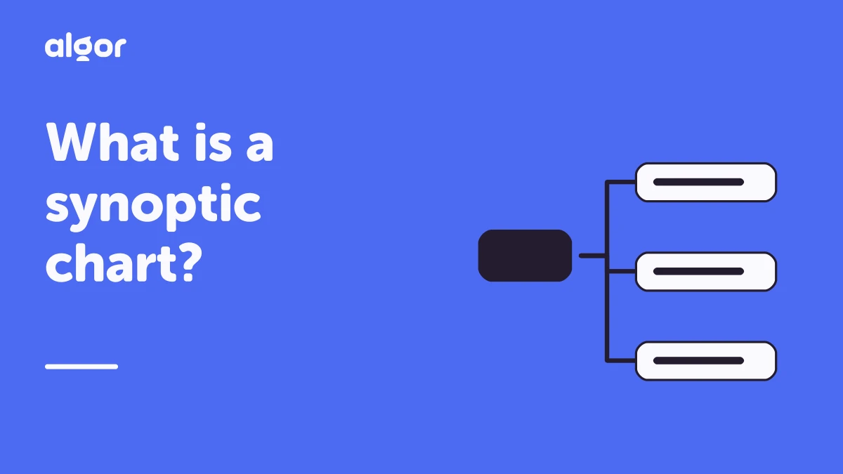
In the example, the topic branches into related categories rather than continuing as a long paragraph. Even before reading every label, you can see which ideas sit at the same level and which provide supporting detail.
What is a synoptic chart used for?
Teachers and students use synoptic charts to summarise the essential information in a text and make the organisation of a topic easier to follow. They are especially useful when the material contains several groups of related concepts.
You may encounter three broad approaches:
- Brace charts: braces divide a topic into categories and subcategories.
- Branching diagrams: lines or boxes show the same hierarchy in a tree-like layout.
- Network-style charts: connections also show relationships between groups where a simple tree would leave something out.
Terminology varies, but the practical goal is consistent: present the material so that its major parts are easy to distinguish. Choose the arrangement that makes your topic clearest rather than forcing it into a particular template.
For studying, the chart becomes a guide to what you need to explain. You can look at a main category, hide its details and try to recall the points underneath. If a branch is difficult to reconstruct, you know where to return to the original text.
For a presentation, the same hierarchy can become your speaking order. Start with the overall topic, introduce each main category, then use selected examples to develop it. Font size and colour can help the audience see the difference between a heading and a supporting detail.
A chart can also help organise the results of a brainstorming session. Once you have collected ideas, group them into categories and remove repetitions. The finished chart gives the loose collection a structure you can work with.
Synoptic chart, concept map and mind map: what is the difference?
All three formats help organise information visually, but they emphasise different things. The most useful distinction is the question each one helps you answer.
A synoptic chart: what are the parts of this topic?
A synoptic chart classifies and divides a topic. It usually moves from the main subject to categories, subcategories and details, often from left to right with braces. It is helpful when you need an orderly overview before studying a topic in depth.
A concept map: how are these ideas related?
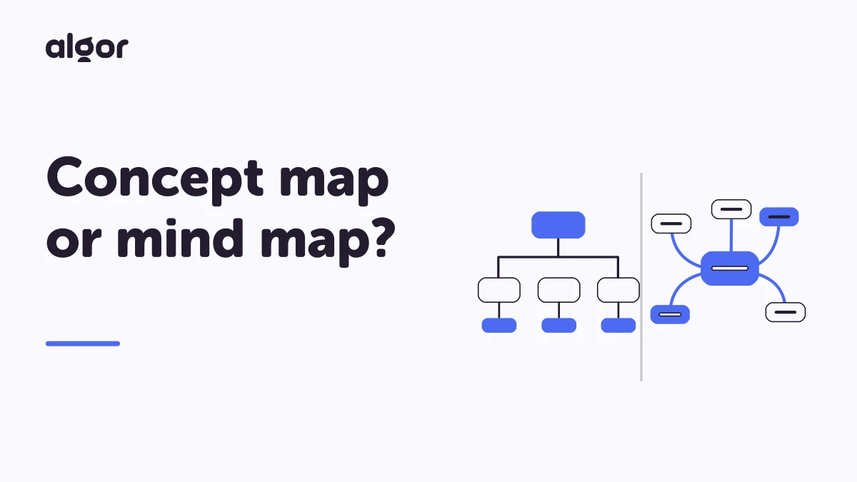
A concept map makes relationships explicit. It can also move from broad to specific ideas, but connecting words explain how one concept relates to another. For example, a link might say “causes”, “depends on” or “is an example of”.
This is the main difference from a synoptic chart: grouping two ideas under the same heading is not the same as explaining the relationship between them. Use a concept map when those relationships are central to what you need to understand.
A mind map: what associations grow from this idea?
A mind map starts with a central idea and branches out radially. It is generally more associative and flexible, often using pictures and different colours. The structure can reflect the creator's own way of thinking about the subject.
You might use a mind map to explore possible essay themes, a synoptic chart to group the chosen material, and a concept map to explain the links within your argument. For a closer comparison, read our guide to concept maps and mind maps.
Five steps to create a synoptic chart
You do not need a complicated tool to get started. Work through these steps with a short section of material first, then use the same process for a longer chapter.
- Read for understanding. Go through the material carefully enough to explain its overall subject. If a key passage is unclear, resolve it before deciding where it belongs in the chart.
- Identify the main ideas. Write down the concepts that carry the explanation. Distinguish a central point from an example, quotation or extra detail. This gives you a manageable set of ideas to organise.
- Choose the central topic. Use a word or short phrase that accurately represents the material. A topic that is too broad makes the chart hard to control; one that is too narrow leaves important ideas outside it.
- Group the concepts. Put related ideas together and decide which are headings and which are supporting points. Check that the categories make sense and that ideas at the same level have a comparable role.
- Build and review the chart. Arrange the subject, main categories, subcategories and details from general to specific. Then read it back: does the hierarchy match the source, and can you explain each branch without adding missing steps?
The first draft does not need to be beautiful. A clear grouping is more valuable than decorative colour. Once the structure works, shorten long labels and use spacing or colour to make the levels easier to see.
Why create a synoptic chart online?

Online charts keep the benefits of a paper outline while making revision and sharing easier. A digital version is particularly useful when your understanding develops and you need to move a whole group of ideas.
The main advantages include:
- Quicker editing: change a label or reorganise a branch without starting again.
- Access from different places: return to your material from the devices you use for studying.
- Extra explanation where it helps: add an image, video or other visual element to clarify a difficult point.
- Simple sharing: send the chart to classmates, colleagues or a teacher for discussion.
Existing examples can help you understand the format. Algor's public Algor Cards library contains maps on a range of topics, including the example shown above. Use an example as a model for structure, then check that your own version fits the material you actually need to learn.
AI can also speed up the first draft. Instead of manually extracting every heading from a long text, you can ask Algor to organise the content into an editable hierarchical map and refine it into the overview you need.
Generate a visual outline from a text with Algor
With Algor Education, you can turn source material into a structured map rather than build every node yourself. The result can support the same task as a synoptic chart: moving from a broad topic to its main categories and details.
From Home, choose Create an Algor Set for a complete study guide with maps and summaries alongside the page text. If you only need the diagram, choose the individual Map content type instead.
You can begin with a PDF or Word document, pasted text, photos of books or handwritten notes, or a topic you type in. For an audio or video recording, use transcription to turn the explanation into text you can study from.
Before generation, specify who the content is for and the style you want. Simple language and a schematic format can be useful for a concise overview. When creating a Set, review the proposed outline so the organisation matches your course material.
The generated map remains editable. Move, rename, add or remove nodes and connections, or describe a change to the AI. Choose a tree, radial or compact layout, adjust colours and fonts, and add images, audio or video where they make the content clearer.
You can also translate the map, use readability options and invite other people as Editors to collaborate in real time. These controls matter because a useful study chart should reflect your understanding, not simply the first version an AI produces.
Read the guide to creating content and the guide to editing and sharing Sets for the current steps. Then try Algor's free plan, which includes limits, with one text you need to organise. Check the hierarchy against the source and use the finished chart to explain the topic in your own words.
Continue exploring


Faq
Frequently Asked Questions


Get Started with Algor
Transform your content into structured, visual and personalized learning paths.

.svg)


